In 2015, State of the State Courts survey respondents were asked: "How would you rate the job being done by courts in your state?" Surprisingly, the question revealed that only 48% of Americans are happy with their courthouse experience. User friendly courthouse design in courthouse planning can boost ratings.
What's Wrong with Courthouses?
What’s behind this low rating? There are many factors, including public perceptions of fairness and justice, negative experiences during the jury process, and the lack of easy to use technology. Another contributing factor can be found in courthouse design.
Prior to the 21st century, architects focused mostly on creating courthouses that embodied authority and security. User friendliness, on the other hand, was not a leading design goal. As a result, many of today’s courthouses are difficult to navigate, limited in public space, and lacking in natural light. This is not to say that these courthouses are poorly designed, as most of them do promote justice and serve as landmarks in their communities. But as with all things, trends change, even in courthouse design. And today, there is a much greater emphasis on the user experience.
Creating A User-Friendly Courthouse
A 2016 guide entitled Creating A User-Friendly Court Structure and Environment was developed jointly by the American Institute of Architects' Academy of Architecture for Justice and the National Association for Court Management. The guide seeks to promote a more customer-oriented courthouse experience through focusing on the building, people, and technology. The guide encourages more discrete security and a logical organization/flow to the facility, with clear wayfinding, a mix of public spaces that allow for interaction and quiet reflection, childcare facilities, and design features that mitigate stress.
This guide contains suggestions to help courts along the path of more fully embracing the public through courthouse design.
The Public Is Important
I had my first experience with user friendliness in court design years ago. I was touring a new courthouse with a small group led by a judge who was heavily involved in the design and construction.
On the tour, the judge pointed out the beautiful entry lobby with visible work from a local artist that provided context and a connection to the community. The public walked through hallways bordering exterior windows with striking views of the cityscape and lots of natural light.
The jury assembly area, where many citizens are first introduced to the court process, was perhaps the most attractive space in the building with ample room, comfortable seating, workstations for waiting jurors, and floor-to-ceiling windows on two sides.
The surprise came when we got to the courtrooms. With such attractive public spaces throughout the building, I expected the courtrooms to be large and ornate, but this was not the case. The courtrooms were more modest spaces - nicely appointed but not extravagant. Likewise, the judges’ chambers were also understated. They were professional office suites with natural lighting and conferencing areas, but certainly not grand like many chambers I have seen.
The judge explained that the courthouse was not a facility that celebrated judges or lawyers – it was a public facility and the public should come first and foremost in its design.
This was an incredible new experience for me. Many courthouses are designed with the courtrooms being the most prominent and important spaces, perhaps followed by the judges’ chambers. Most of the public spaces are undersized and many courthouses do not have the space for dedicated jury assembly rooms.
The courthouse I was touring was designed back in the 1990s. In my opinion, it was a forerunner of courthouses focused on the public experience as a design feature.
Design Features for User Friendliness
When designing a courthouse, there is an inherent tension between formality and security (potentially intimidating the public) versus comfort and openness (more welcoming to the public). Emerging trends shift this balance toward a more customer-oriented and welcoming facility.
The following three examples are just a few of the user-friendly features that can be incorporated into courthouse design.
Welcoming Lobby
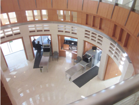
In many courthouses, the first notable feature in the lobby is the security screening area. In more user-friendly designs, the lobby has adequate queuing space so that visitors gain an impression of the lobby as an attractive public space before entering through security. Also, when security screening is integrated into the architecture, it is less obtrusive and intimidating to visitors. Advances in technology enable security components to be more discreet without compromising security.

Welcoming Lobby
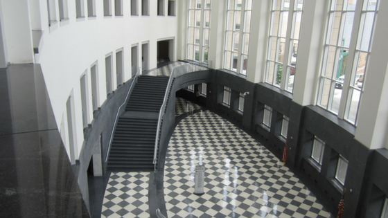
Another user-friendly feature is to design lobbies that extend two or more floors. When combined with windows, the space is flooded with natural light and the height creates an awe-inspiring feeling. It also helps the user better understand the organization of the building as they progress through the facility. A set of stairs or an escalator from the main lobby helps with this progression, as opposed to having people move from the lobby straight onto an elevator, which cuts off visual continuity.
Organized Layout
A courthouse should have a logical progression. Components that have more public traffic, such as the court clerk’s office or jury assembly area, should ideally be located adjacent to the lobby or on lower floors. Often, courtrooms can be placed on higher floors as they do not receive a continual flow of public traffic.

Wayfinding Screen
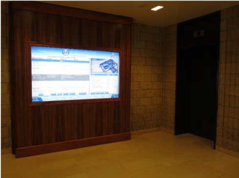
Having a logical progression of spaces helps users understand the facility and feel more comfortable finding where they need to go. Signs that indicate direction should be clearly visible. Many facilities use kiosks and interactive screens to help with wayfinding. These systems direct the public and provide their current location as a reference point. They also contain directories of spaces in the building as well as the schedule of court proceedings.
Public Circulation
Courthouses are challenging facilities to design because they have three separate circulation patterns: secured – for prisoners going to and returning from court; restricted – for judges to move through the courthouse without crossing paths with prisoners or the public; and public - the pathways for visitors to move throughout the courthouse.

Public Hallway with Natural Light
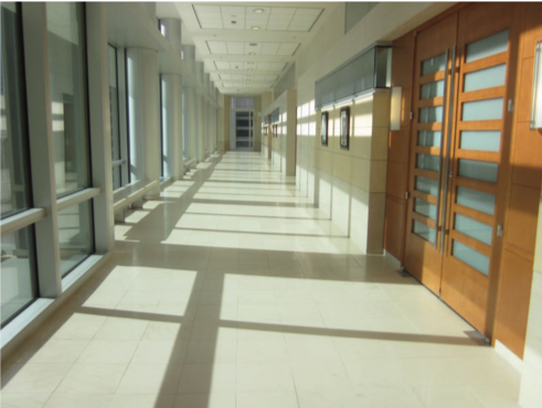
In many courthouses, public circulation occurs in interior hallways that provide little in the way of visual reference. More user-friendly designs provide public circulation patterns in wide hallways with natural light and views of the surrounding community. Spaces like these also help mitigate stress.
Exciting Era in Courthouse Design
The examples above have focused primarily on the lobby area and public pathways in the building. There are many other areas of the courthouse that can have a user-friendly design, from courtrooms with convenient technology for viewing evidence, to a mix of public space types that include open spaces for interaction and quieter spaces for reflection. This is an exciting era in courthouse design, as these user-friendly elements give rise to the design goals of openness, transparency, and democracy. We will publish a future e-book with more examples of user-friendly best practices.


.jpg)
.jpg)
.jpg)
.jpg)
.jpg)
.jpg)


.jpg)
.jpg)
.jpg)

